Exploring Data in Superset
In this tutorial, we will introduce key concepts in Apache Superset through the exploration of a real dataset which contains the flights made by employees of a UK-based organization in 2011. The following information about each flight is given:
- The traveller’s department. For the purposes of this tutorial the departments have been renamed Orange, Yellow and Purple.
- The cost of the ticket.
- The travel class (Economy, Premium Economy, Business and First Class).
- Whether the ticket was a single or return.
- The date of travel.
- Information about the origin and destination.
- The distance between the origin and destination, in kilometers (km).
Enabling Data Upload Functionality
You may need to enable the functionality to upload a CSV or Excel file to your database. The following section explains how to enable this functionality for the examples database.
In the top menu, select Data ‣ Databases. Find the examples database in the list and select the Edit button.

In the resulting modal window, switch to the Extra tab and tick the checkbox for Allow Data Upload. End by clicking the Save button.

Loading CSV Data
Download the CSV dataset to your computer from GitHub. In the Superset menu, select Data ‣ Upload a CSV.

Then, enter the Table Name as tutorial_flights and select the CSV file from your computer.
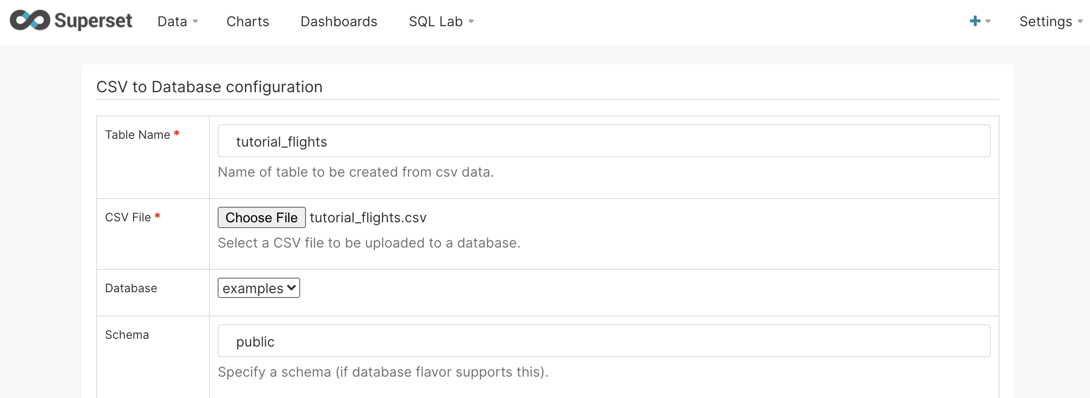
Next enter the text Travel Date into the Parse Dates field.

Leaving all the other options in their default settings, select Save at the bottom of the page.
Table Visualization
You should now see tutorial_flights as a dataset in the Datasets tab. Click on the entry to launch an Explore workflow using this dataset.
In this section, we'll create a table visualization to show the number of flights and cost per travel class.
By default, Apache Superset only shows the last week of data. In our example, we want to visualize all of the data in the dataset. Click the Time ‣ Time Range section and change the Range Type to No Filter.
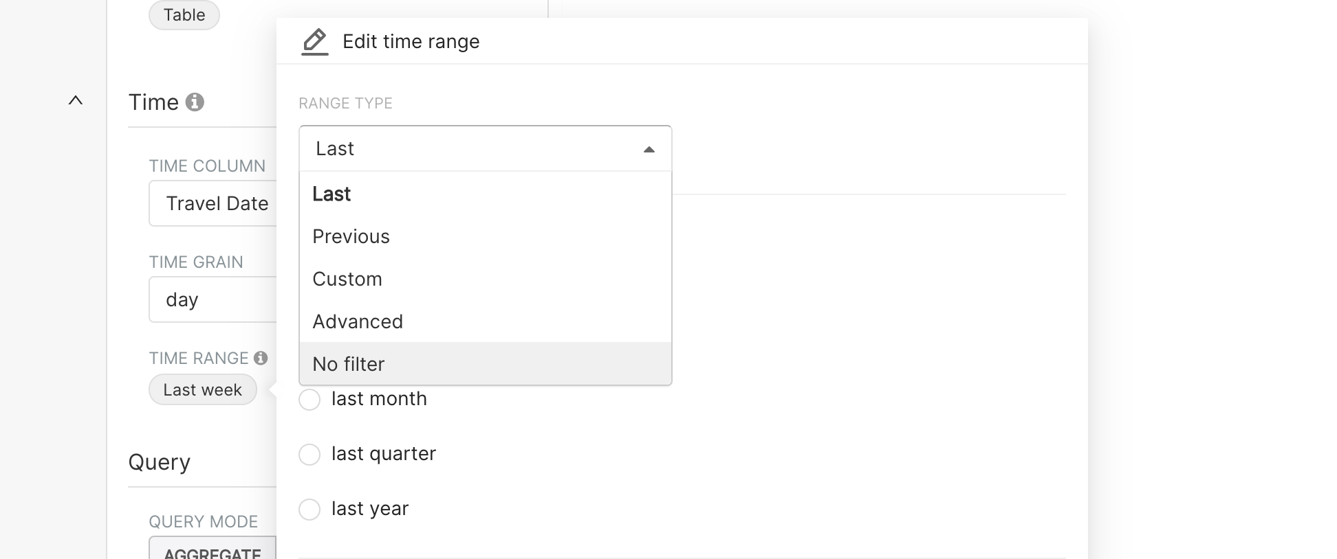
Click Apply to save.
Now, we want to specify the rows in our table by using the Group by option. Since in this example, we want to understand different Travel Classes, we select Travel Class in this menu.
Next, we can specify the metrics we would like to see in our table with the Metrics option.
COUNT(*), which represents the number of rows in the table (in this case, quantity of flights in each Travel Class)SUM(Cost), which represents the total cost spent by each Travel Class
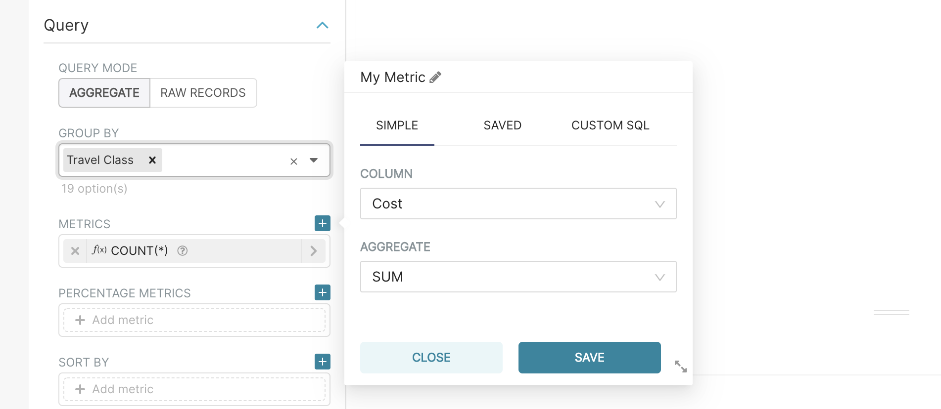
Finally, select Run Query to see the results of the table.

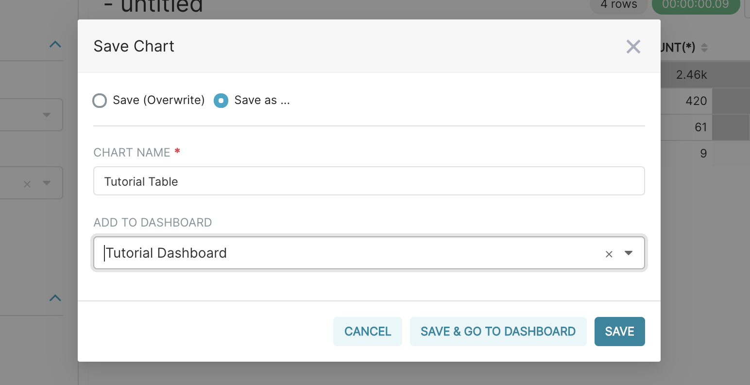
To save the visualization, click on Save in the top left of the screen. In the following modal,
- Select the Save as option and enter the chart name as Tutorial Table (you will be able to find it again through the Charts screen, accessible in the top menu).
- Select Add To Dashboard and enter Tutorial Dashboard. Finally, select Save & Go To Dashboard.
Dashboard Basics
Next, we are going to explore the dashboard interface. If you’ve followed the previous section, you should already have the dashboard open. Otherwise, you can navigate to the dashboard by selecting Dashboards on the top menu, then Tutorial dashboard from the list of dashboards.
On this dashboard you should see the table you created in the previous section. Select Edit dashboard and then hover over the table. By selecting the bottom right hand corner of the table (the cursor will change too), you can resize it by dragging and dropping.
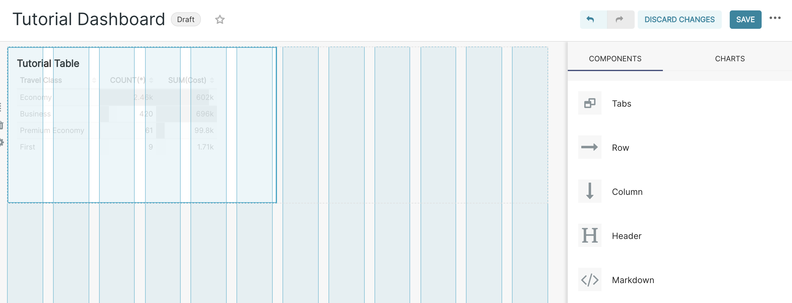
Finally, save your changes by selecting Save changes in the top right.
Pivot Table
In this section, we will extend our analysis using a more complex visualization, Pivot Table. By the end of this section, you will have created a table that shows the monthly spend on flights for the first six months, by department, by travel class.
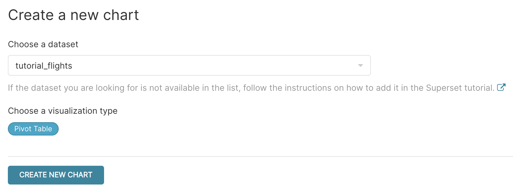
Create a new chart by selecting + ‣ Chart from the top right corner. Choose tutorial_flights again as a datasource, then click on the visualization type to get to the visualization menu. Select the Pivot Table visualization (you can filter by entering text in the search box) and then Create New Chart.
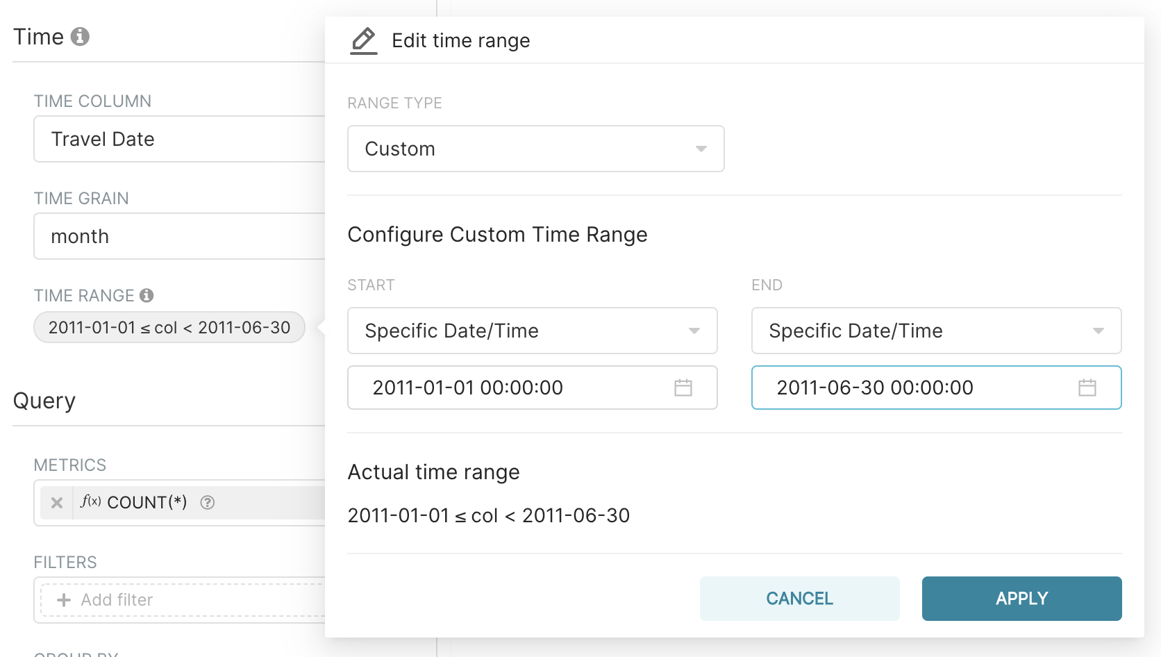
In the Time section, keep the Time Column as Travel Date (this is selected automatically as we only have one time column in our dataset). Then select Time Grain to be month as having daily data would be too granular to see patterns from. Then select the time range to be the first six months of 2011 by click on Last week in the Time Range section, then in Custom selecting a Start / end of 1st January 2011 and 30th June 2011 respectively by either entering directly the dates or using the calendar widget (by selecting the month name and then the year, you can move more quickly to far away dates).
Next, within the Query section, remove the default COUNT(*) and add Cost, keeping the default SUM aggregate. Note that Apache Superset will indicate the type of the metric by the symbol on the left hand column of the list (ABC for string, # for number, a clock face for time, etc.).
In Group by select Time: this will automatically use the Time Column and Time Grain selections we defined in the Time section.
Within Columns, select first Department and then Travel Class. All set – let’s Run Query to see some data!
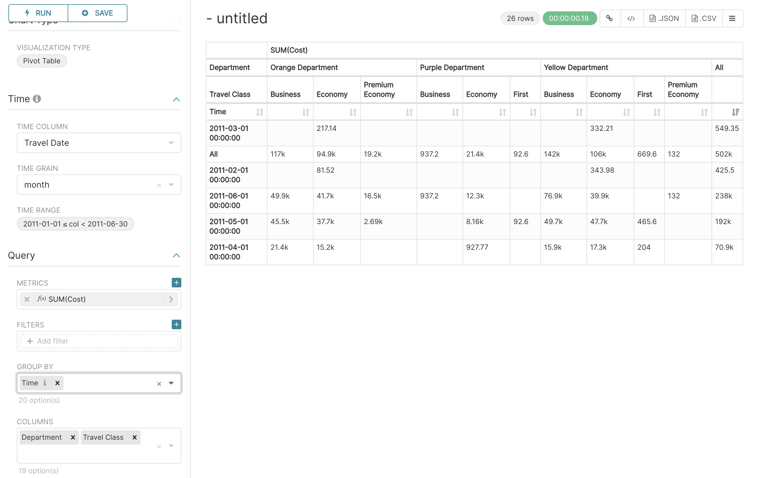
You should see months in the rows and Department and Travel Class in the columns. Publish this chart to your existing Tutorial Dashboard you created earlier.
Line Chart
In this section, we are going to create a line chart to understand the average price of a ticket by month across the entire dataset.
In the Time section, as before, keep the Time Column as Travel Date and Time Grain as month but this time for the Time range select No filter as we want to look at entire dataset.
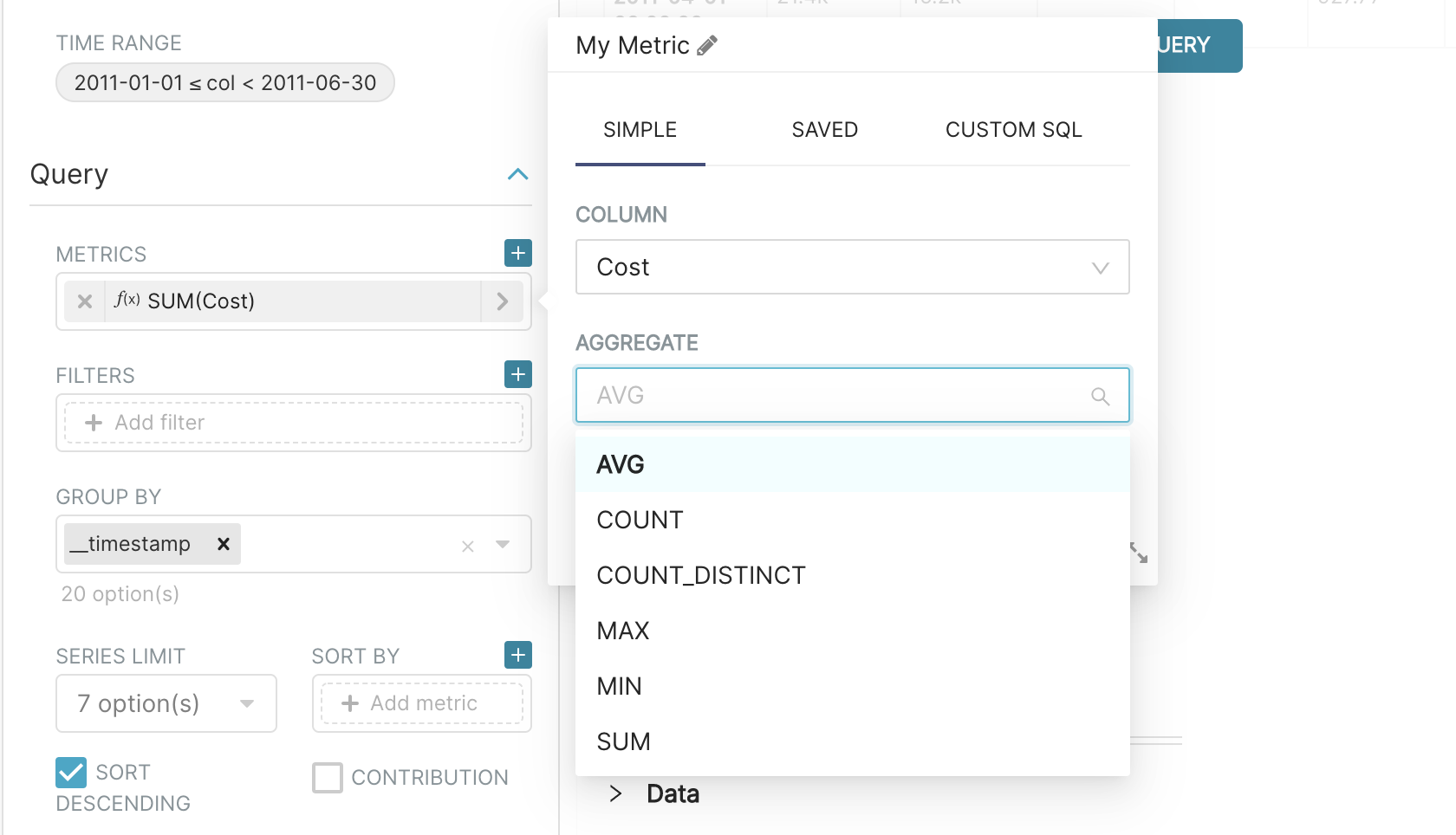
Within Metrics, remove the default COUNT(*) metric and instead add AVG(Cost), to show the mean value.
Next, select Run Query to show the data on the chart.
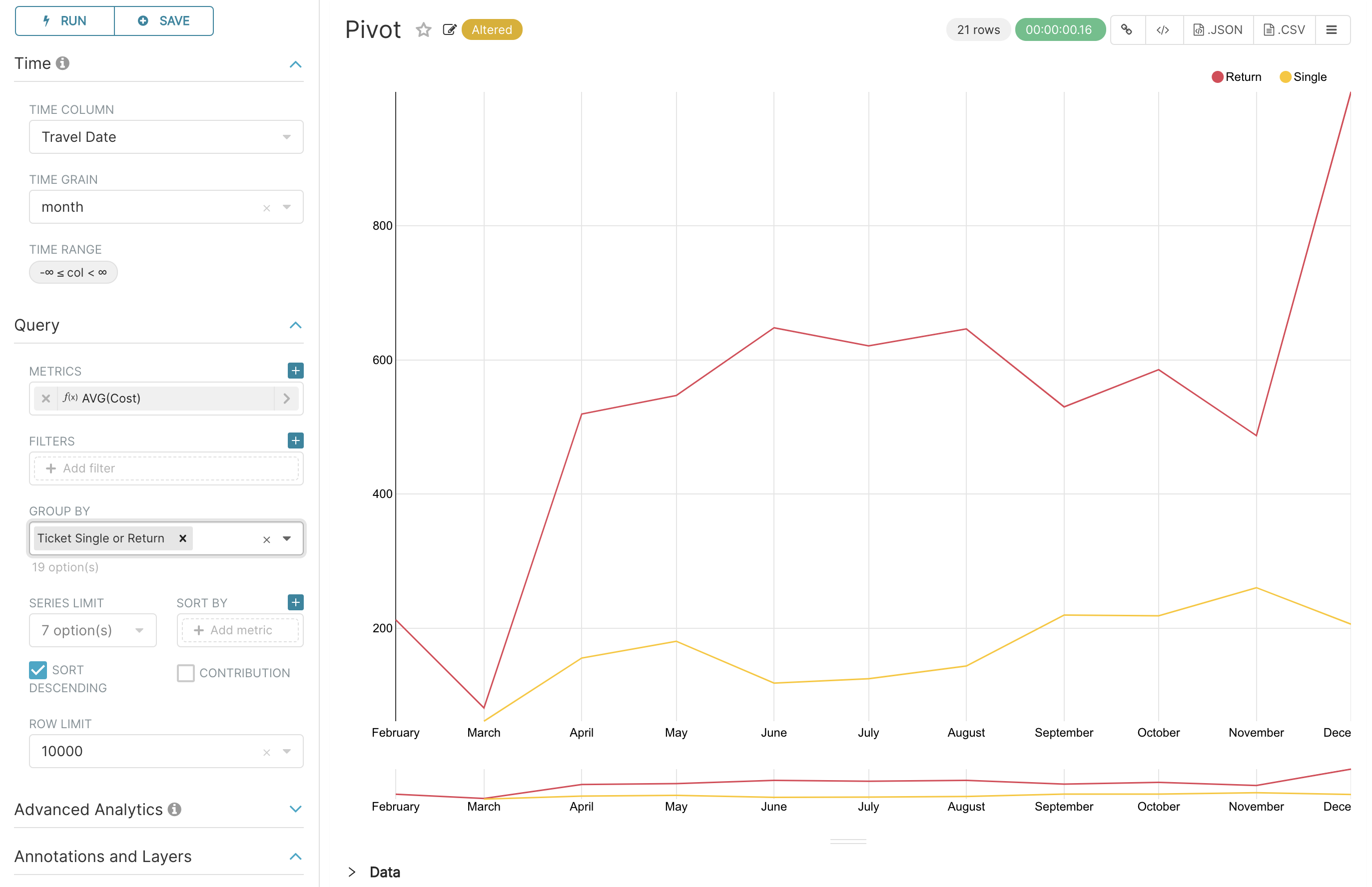
How does this look? Well, we can see that the average cost goes up in December. However, perhaps it doesn’t make sense to combine both single and return tickets, but rather show two separate lines for each ticket type.
Let’s do this by selecting Ticket Single or Return in the Group by box, and the selecting Run Query again. Nice! We can see that on average single tickets are cheaper than returns and that the big spike in December is caused by return tickets.
Our chart is looking pretty good already, but let’s customize some more by going to the Customize tab on the left hand pane. Within this pane, try changing the Color Scheme, removing the range filter by selecting No in the Show Range Filter drop down and adding some labels using X Axis Label and Y Axis Label.
Once you’re done, publish the chart in your Tutorial Dashboard.
Markup
In this section, we will add some text to our dashboard. If you’re there already, you can navigate to the dashboard by selecting Dashboards on the top menu, then Tutorial dashboard from the list of dashboards. Got into edit mode by selecting Edit dashboard.
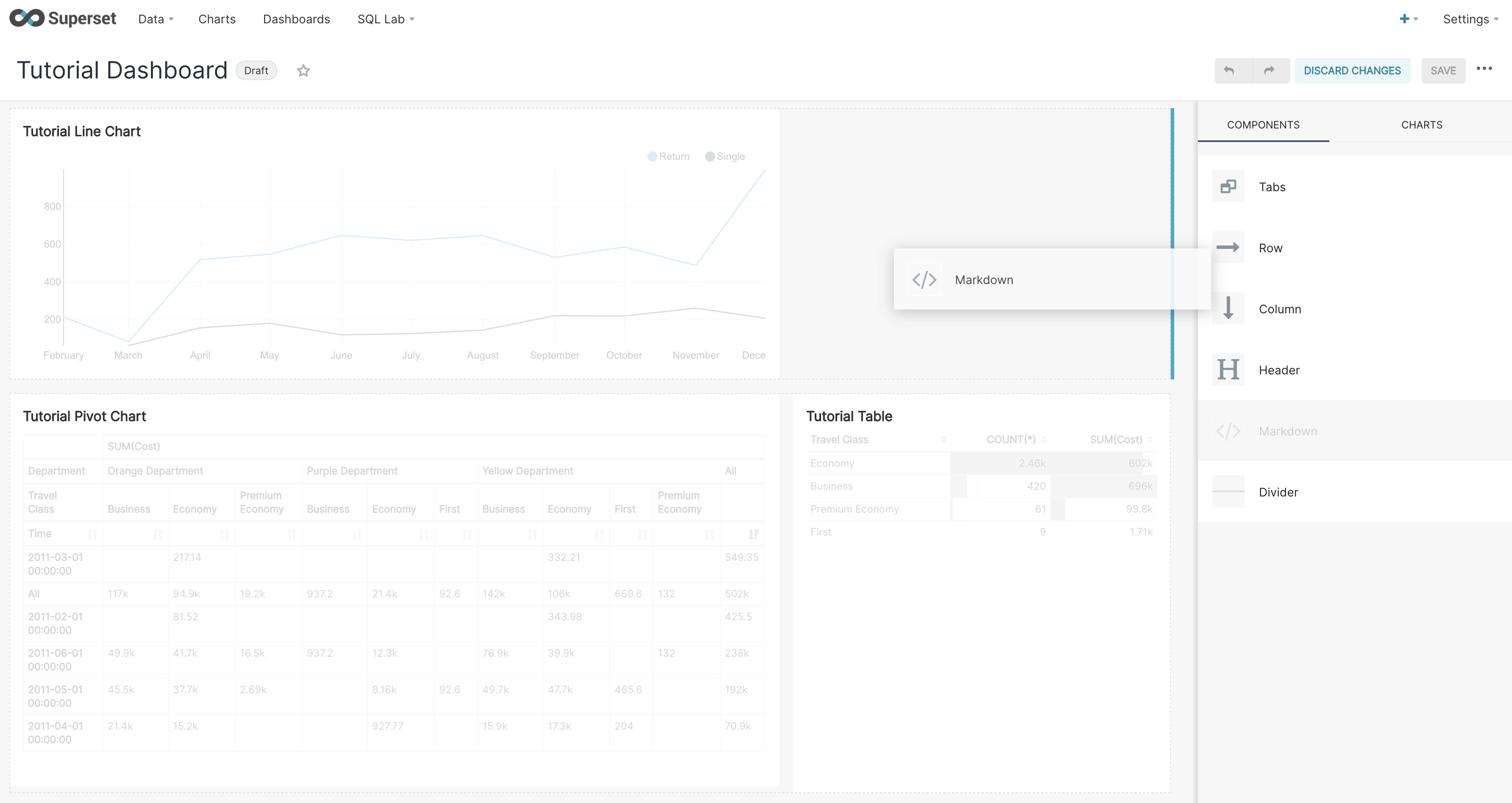
Within the Insert components pane, drag and drop a Markdown box on the dashboard. Look for the blue lines which indicate the anchor where the box will go.
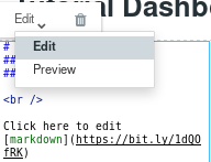
Now, to edit the text, select the box. You can enter text, in markdown format (see this Markdown Cheatsheet for more information about this format). You can toggle between Edit and Preview using the menu on the top of the box.
To exit, select any other part of the dashboard. Finally, don’t forget to keep your changes using Save changes.
Filter Box
In this section, you will learn how to add a filter to your dashboard. Specifically, we will create a filter that allows us to look at those flights that depart from a particular country.
A filter box visualization can be created as any other visualization by selecting + ‣ Chart, and then tutorial_flights as the datasource and Filter Box as the visualization type.
First of all, in the Time section, remove the filter from the Time range selection by selecting No filter.
Next, in Filters Configurations first add a new filter by selecting the plus sign and then edit the newly created filter by selecting the pencil icon.
For our use case, it makes most sense to present a list of countries in alphabetical order. First, enter the column as Origin Country and keep all other options the same and then select Run Query. This gives us a preview of our filter.
Next, remove the date filter by unchecking the Date Filter checkbox.
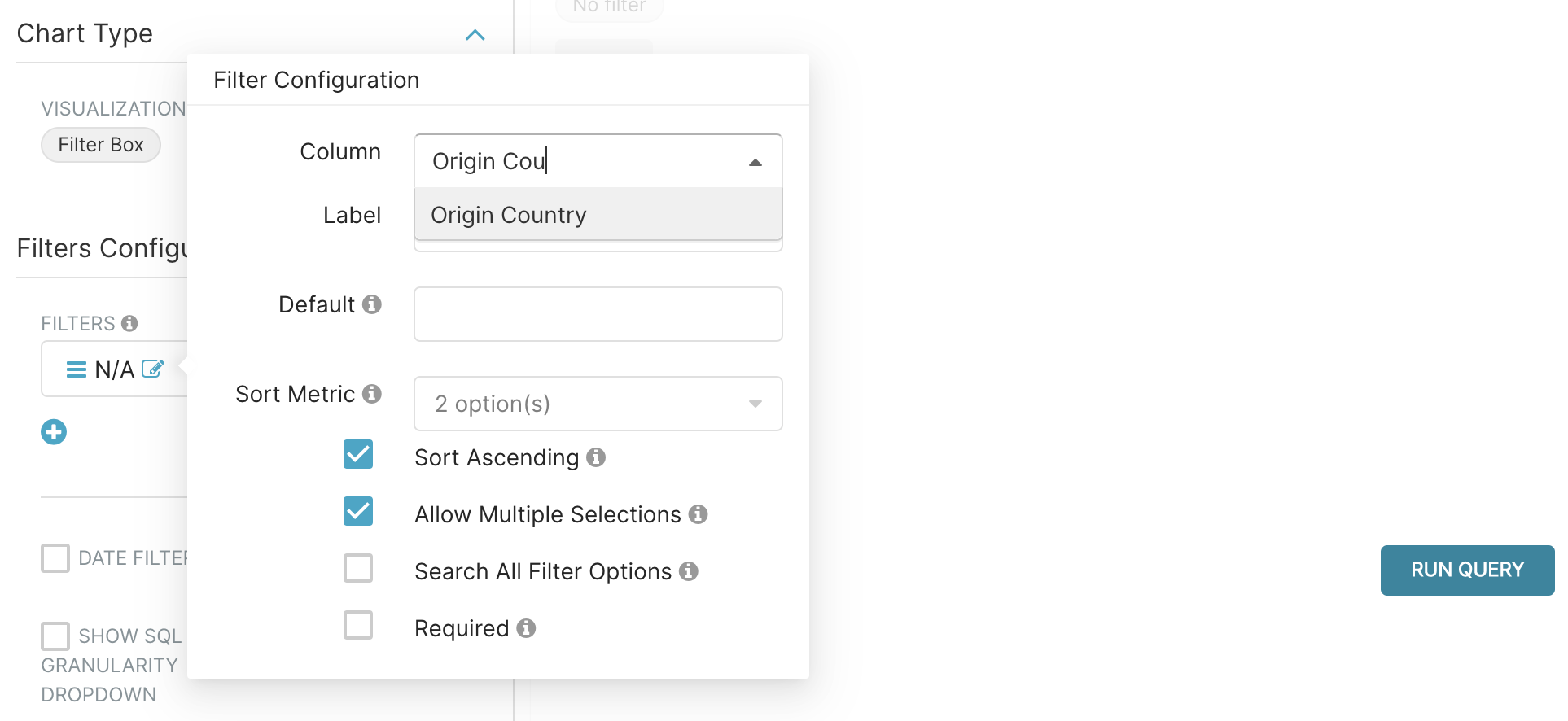
Finally, select Save, name the chart as Tutorial Filter, add the chart to our existing Tutorial Dashboard and then Save & go to dashboard. Once on the Dashboard, try using the filter to show only those flights that departed from the United Kingdom – you will see the filter is applied to all of the other visualizations on the dashboard.
Publishing Your Dashboard
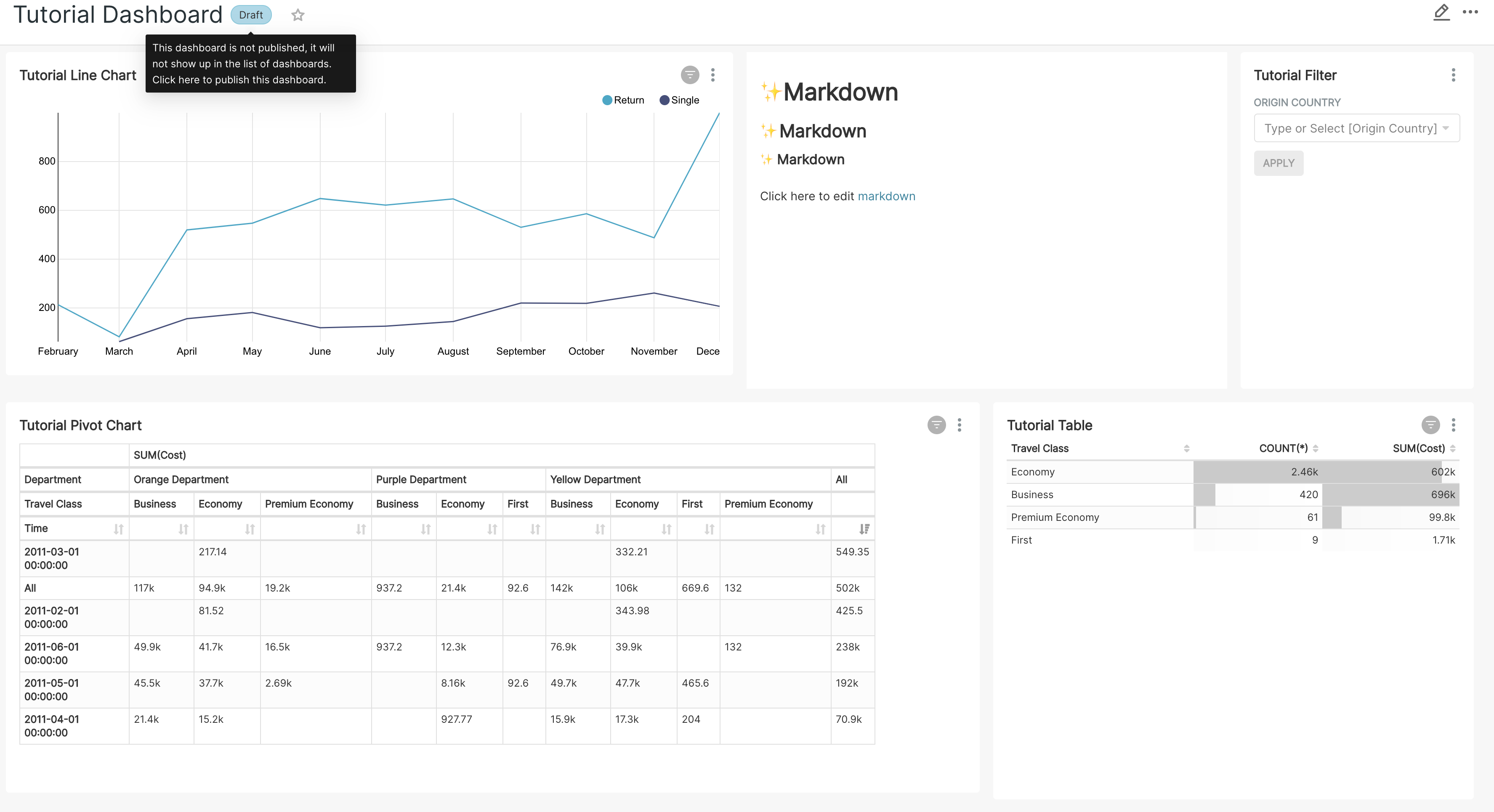
If you have followed all of the steps outlined in the previous section, you should have a dashboard that looks like the below. If you would like, you can rearrange the elements of the dashboard by selecting Edit dashboard and dragging and dropping.
If you would like to make your dashboard available to other users, simply select Draft next to the title of your dashboard on the top left to change your dashboard to be in Published state. You can also favorite this dashboard by selecting the star.
Annotations
Annotations allow you to add additional context to your chart. In this section, we will add an annotation to the Tutorial Line Chart we made in a previous section. Specifically, we will add the dates when some flights were cancelled by the UK’s Civil Aviation Authority in response to the eruption of the Grímsvötn volcano in Iceland (23-25 May 2011).
First, add an annotation layer by navigating to Manage ‣ Annotation Layers. Add a new annotation layer by selecting the green plus sign to add a new record. Enter the name Volcanic Eruptions and save. We can use this layer to refer to a number of different annotations.
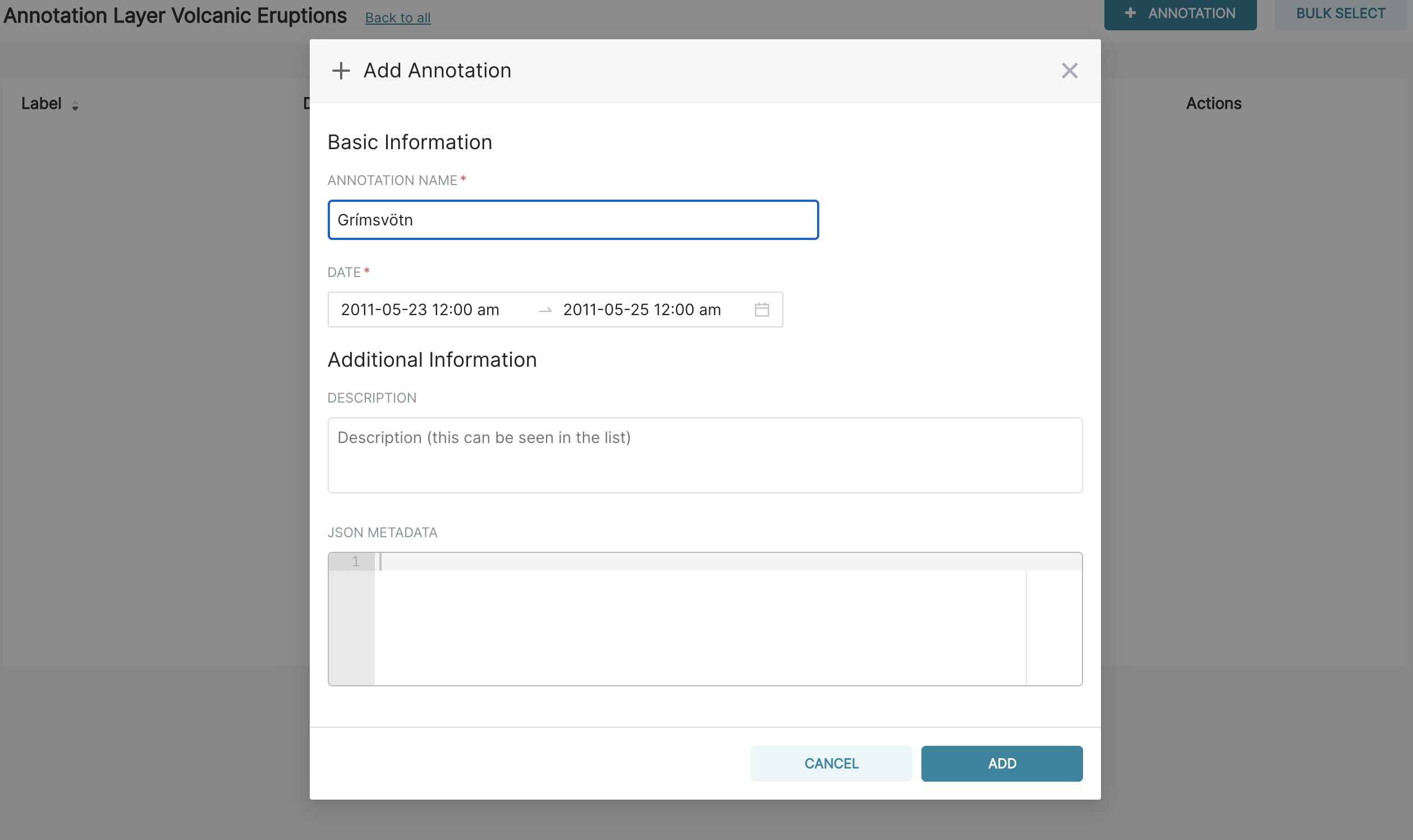
Next, add an annotation by navigating to Manage ‣ Annotations and then create a new annotation by selecting the green plus sign. Then, select the Volcanic Eruptions layer, add a short description Grímsvötn and the eruption dates (23-25 May 2011) before finally saving.
Then, navigate to the line chart by going to Charts then selecting Tutorial Line Chart from the list. Next, go to the Annotations and Layers section and select Add Annotation Layer. Within this dialogue:
- Name the layer as Volcanic Eruptions
- Change the Annotation Layer Type to Event
- Set the Annotation Source as Superset annotation
- Specify the Annotation Layer as Volcanic Eruptions
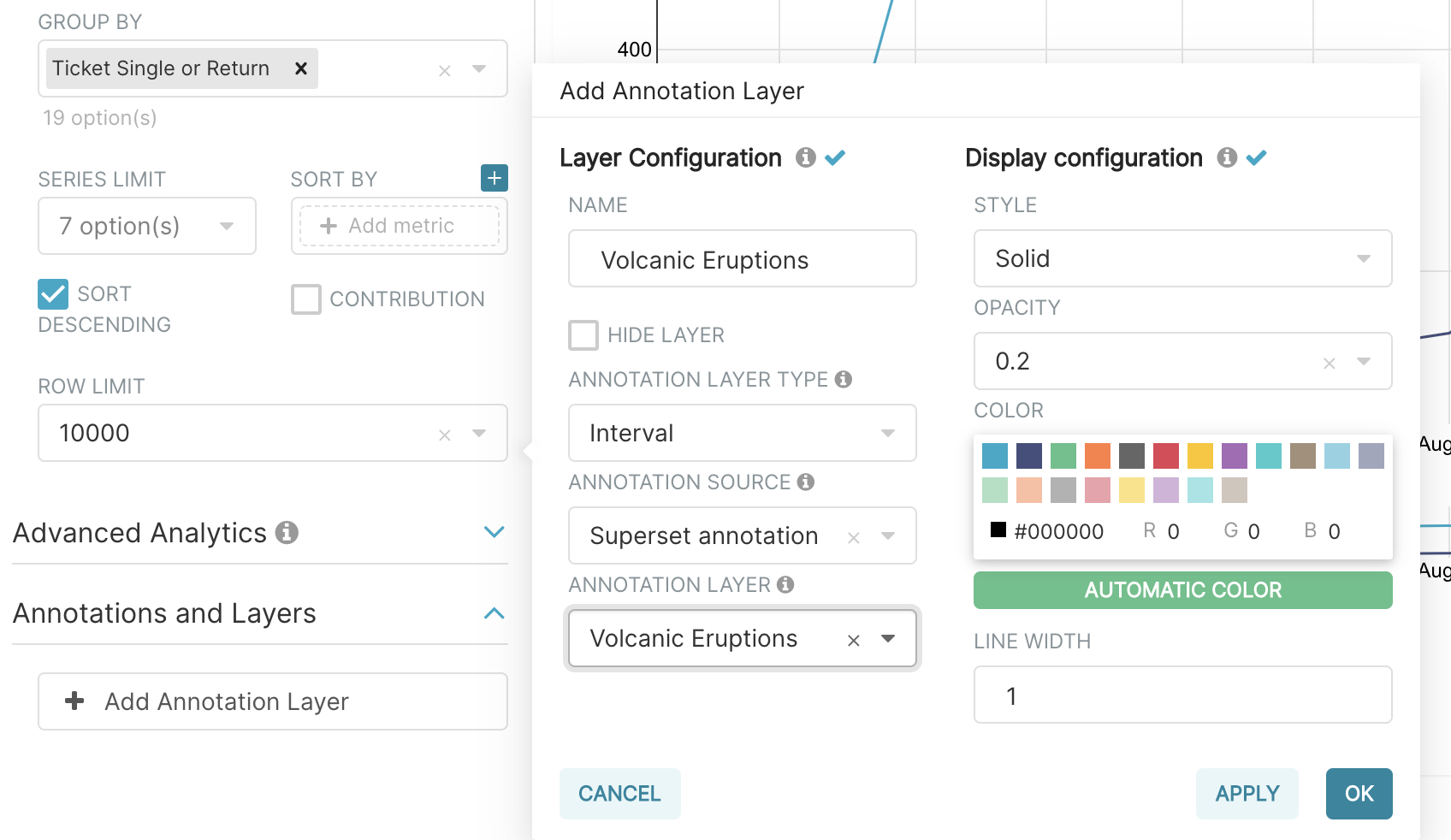
Select Apply to see your annotation shown on the chart.
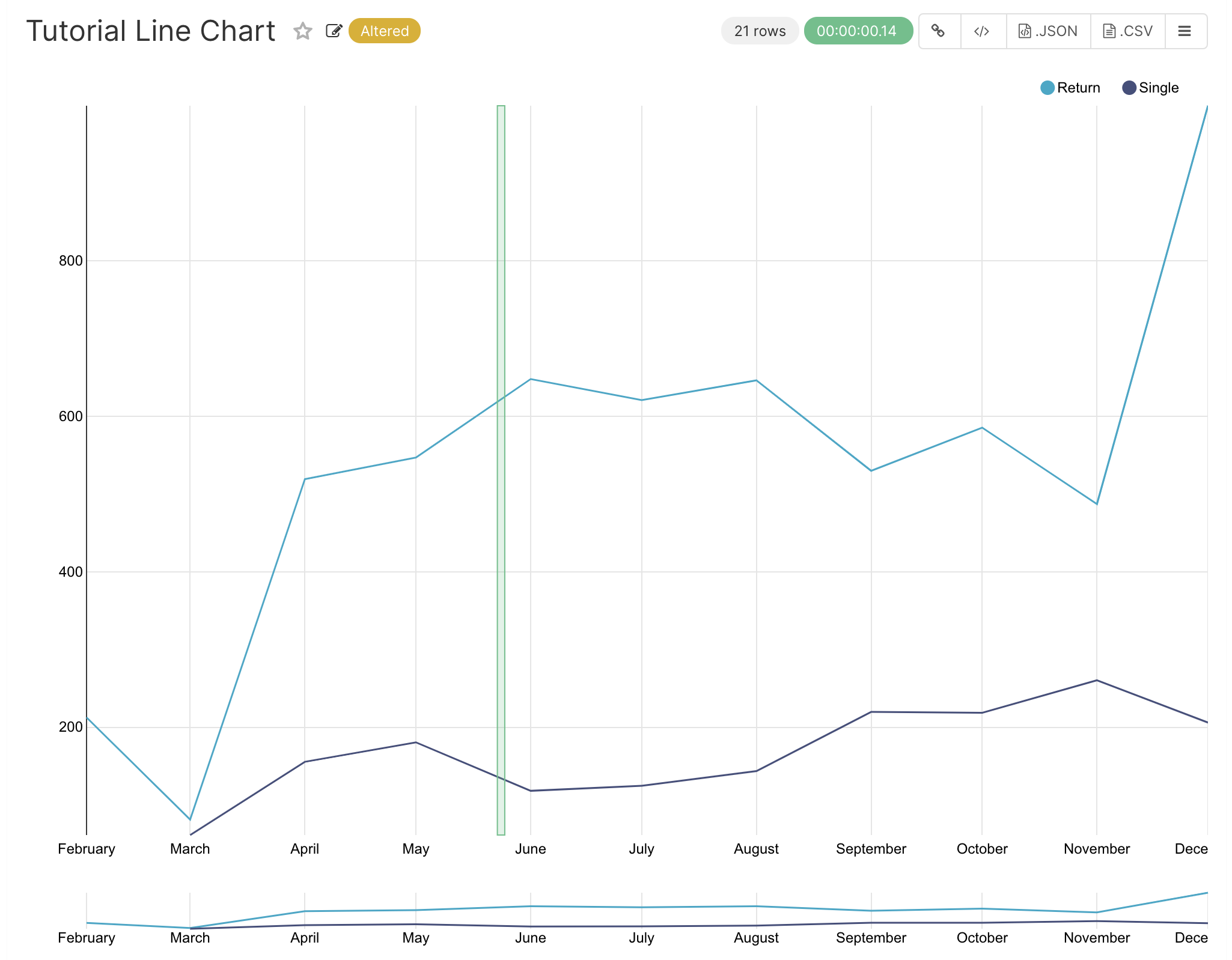
If you wish, you can change how your annotation looks by changing the settings in the Display configuration section. Otherwise, select OK and finally Save to save your chart. If you keep the default selection to overwrite the chart, your annotation will be saved to the chart and also appear automatically in the Tutorial Dashboard.
Advanced Analytics
In this section, we are going to explore the Advanced Analytics feature of Apache Superset that allows you to apply additional transformations to your data. The three types of transformation are:
Setting up the base chart
In this section, we’re going to set up a base chart which we can then apply the different Advanced Analytics features to. Start off by creating a new chart using the same tutorial_flights datasource and the Line Chart visualization type. Within the Time section, set the Time Range as 1st October 2011 and 31st October 2011.
Next, in the query section, change the Metrics to the sum of Cost. Select Run Query to show the chart. You should see the total cost per day for each month in October 2011.
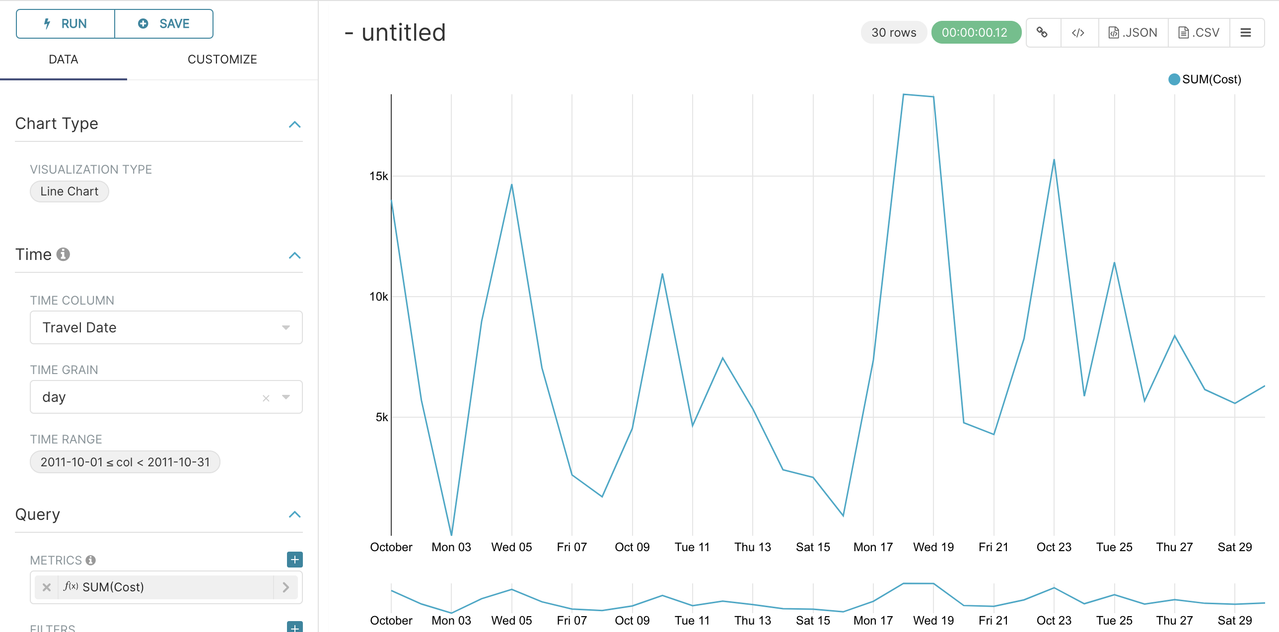
Finally, save the visualization as Tutorial Advanced Analytics Base, adding it to the Tutorial Dashboard.
Rolling Mean
There is quite a lot of variation in the data, which makes it difficult to identify any trend. One approach we can take is to show instead a rolling average of the time series. To do this, in the Moving Average subsection of Advanced Analytics, select mean in the Rolling box and enter 7 into both Periods and Min Periods. The period is the length of the rolling period expressed as a multiple of the Time Grain. In our example, the Time Grain is day, so the rolling period is 7 days, such that on the 7th October 2011 the value shown would correspond to the first seven days of October 2011. Lastly, by specifying Min Periods as 7, we ensure that our mean is always calculated on 7 days and we avoid any ramp up period.
After displaying the chart by selecting Run Query you will see that the data is less variable and that the series starts later as the ramp up period is excluded.
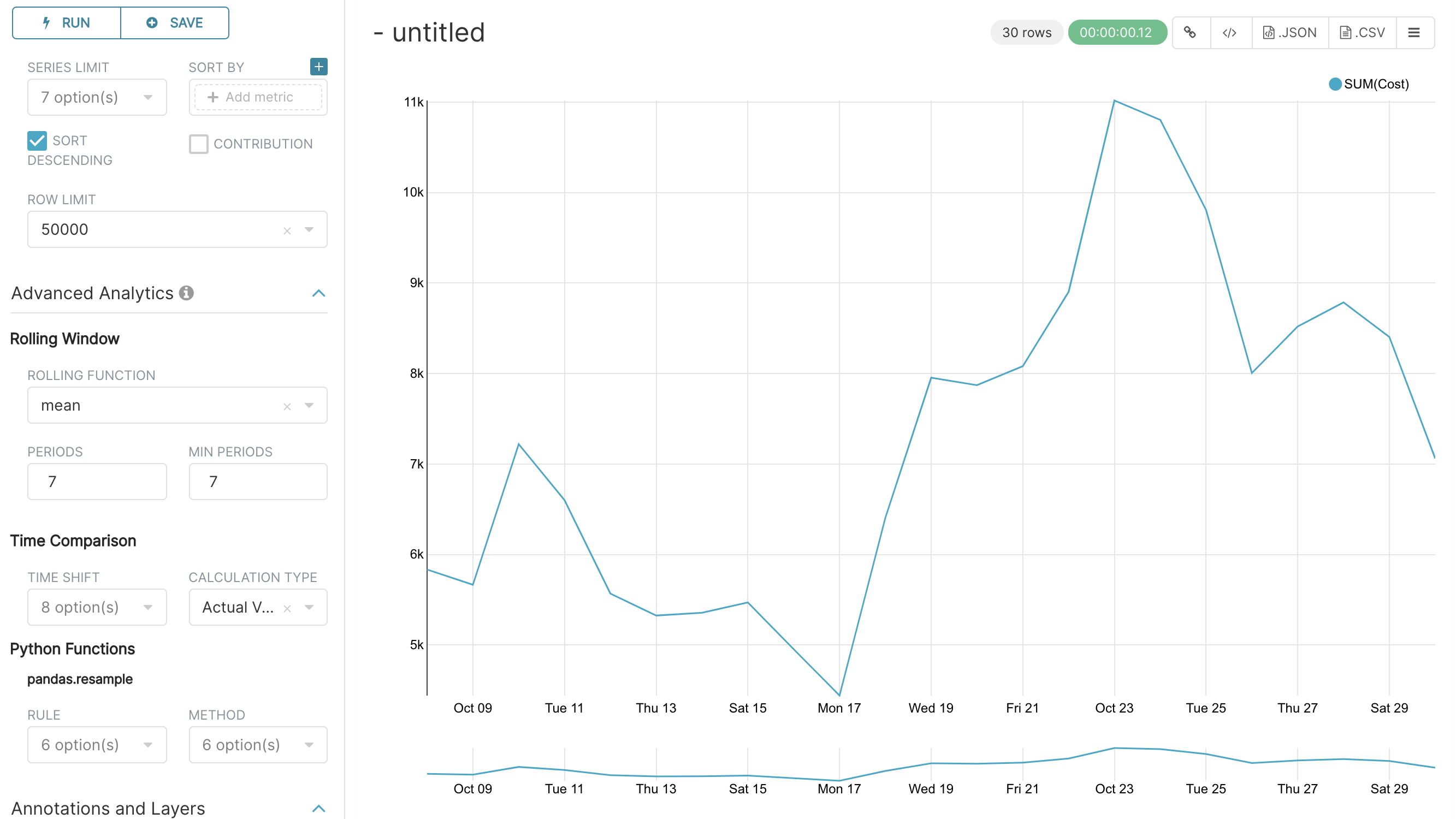
Save the chart as Tutorial Rolling Mean and add it to the Tutorial Dashboard.
Time Comparison
In this section, we will compare values in our time series to the value a week before. Start off by opening the Tutorial Advanced Analytics Base chart, by going to Charts in the top menu and then selecting the visualization name in the list (alternatively, find the chart in the Tutorial Dashboard and select Explore chart from the menu for that visualization).
Next, in the Time Comparison subsection of Advanced Analytics, enter the Time Shift by typing in “minus 1 week” (note this box accepts input in natural language). Run Query to see the new chart, which has an additional series with the same values, shifted a week back in time.
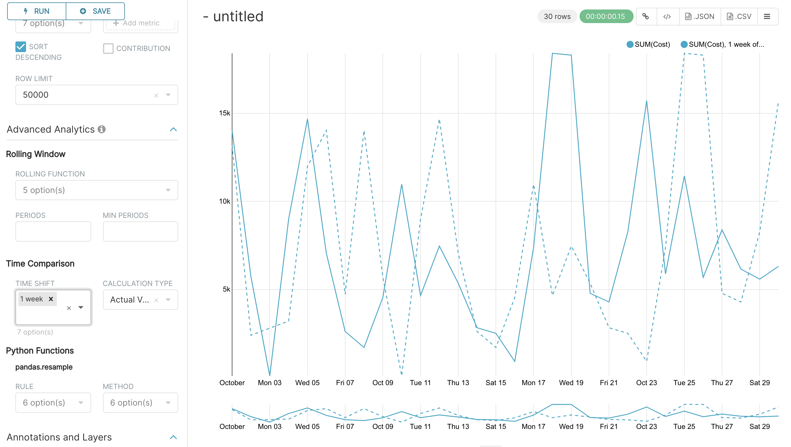
Then, change the Calculation type to Absolute difference and select Run Query. We can now see only one series again, this time showing the difference between the two series we saw previously.
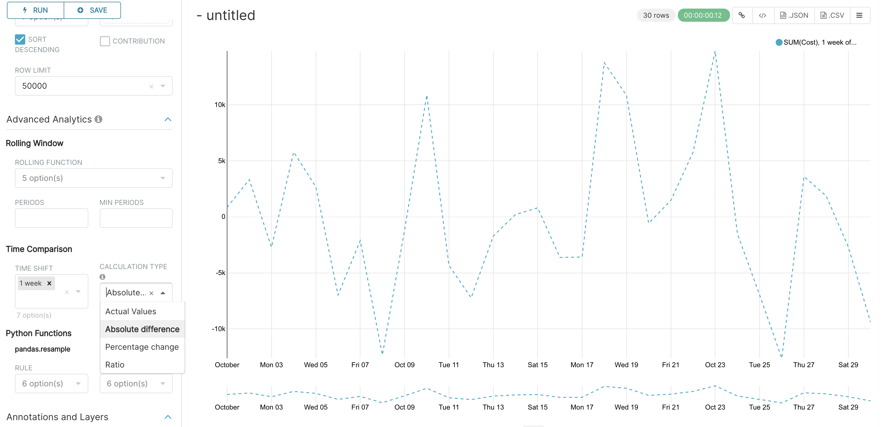
Save the chart as Tutorial Time Comparison and add it to the Tutorial Dashboard.
Resampling the data
In this section, we’ll resample the data so that rather than having daily data we have weekly data. As in the previous section, reopen the Tutorial Advanced Analytics Base chart.
Next, in the Python Functions subsection of Advanced Analytics, enter 7D, corresponding to seven days, in the Rule and median as the Method and show the chart by selecting Run Query.
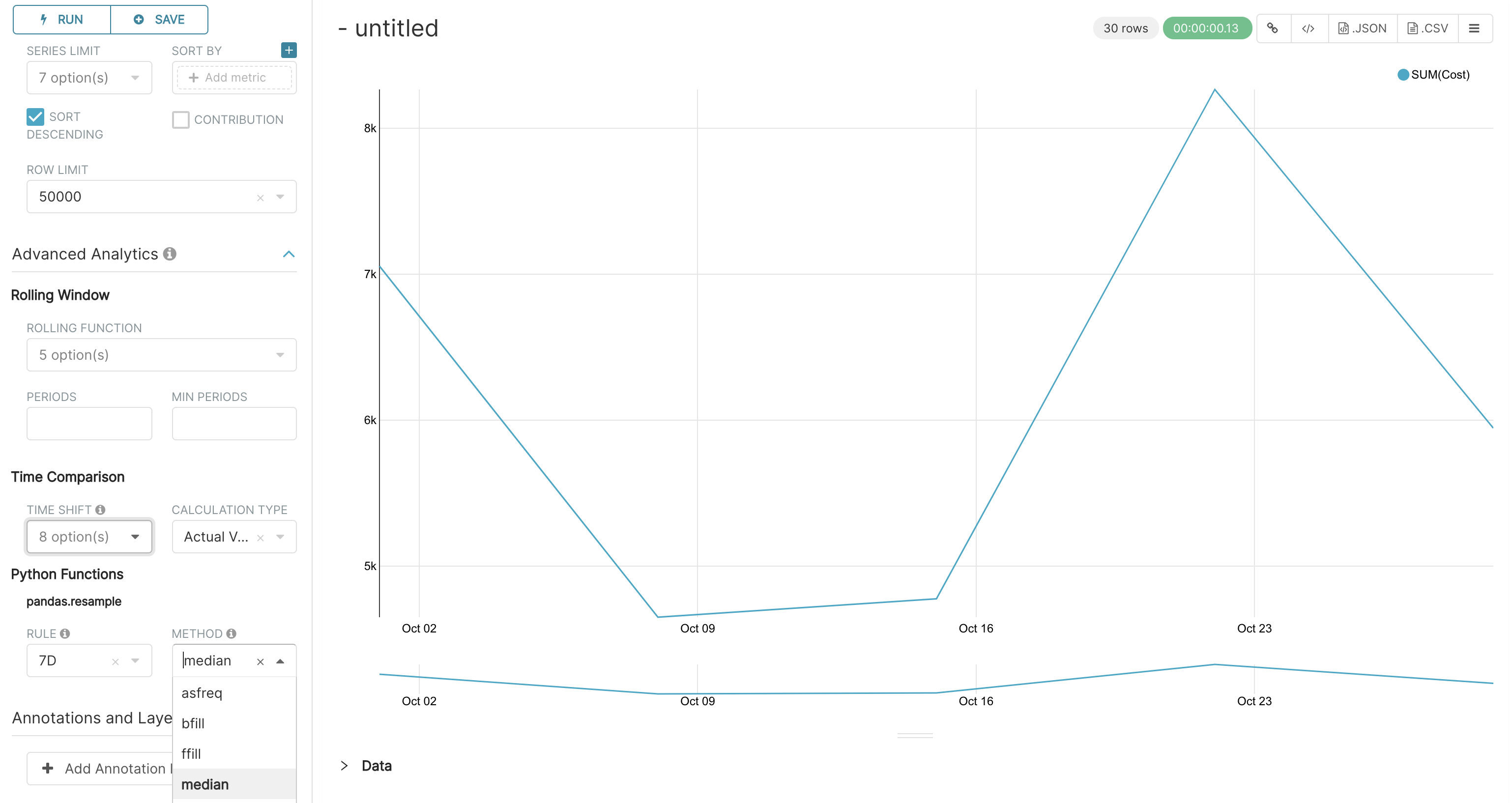
Note that now we have a single data point every 7 days. In our case, the value showed corresponds to the median value within the seven daily data points. For more information on the meaning of the various options in this section, refer to the Pandas documentation.
Lastly, save your chart as Tutorial Resample and add it to the Tutorial Dashboard. Go to the tutorial dashboard to see the four charts side by side and compare the different outputs.